I’ve written about Robert Rosewarne and Fran Jones on this blog before. Artists, printers, and publishers, the two were a part of Ottawa’s vibrant literary and visual arts community in the early 1960s. Ottawa being Ottawa, though, there is little information available and little research has been performed on their work. This blog is actually one of the few hits when you search Rosewarne or their press, the “Blue R Hand Press”, on Google.

Consequently, I was delighted to come across a reference to their work recently. In Fine Printing: The Private Press in Canada, a catalogue related to a traveling exhibition organized by the Canadian Bookbinders and Book Artists Guild and the Friends of Thomas Fisher Rare Book Library in 1995, the Blue R Hand Press gets a mention. The two books Rosewarne designed and printed for Jay Macpherson’s Emblem Books were included in the exhibition. More interestingly, the book quoted from a publication another private press exhibit, leading to another book that offered further context.

Reader, Lover of Books, Lover of Heaven is “a catalogue based on a exhibition of the book arts in Ontario compiled by David B. Kotin with a checklist of Ontario private presses by Marilyn Reuter.” It was published by the North York Public Library in 1978 to mark the opening of the Canadiana Collection in its new quarters at the library. An exhibition ran from March 21 to April 30, 1977, to celebrate. Frances Rosewarne [Fran Jones], is quoted under “BLUE R PRESS, Ottawa, 1961-1965”:
Bob and I, both printmakers, needed a press of our own. In Westport Bob and an artist friend from the Queen Street Studios finally found the “Blue R” at the Westport [Ont.] Mirror. It was a beauty, with Greek column support for the bed with vestiges of blue and gold paint on the name plate. It was Taylor-Washington, very similar to the one shown as William Lyon Mackenzie’s in one of the Toronto Museum’s publications. One of the uprights had even been smashed which unfortunately made it erratic for printing (smahsed by the Family Compact and reborn as the Blue R, I fancy). Bob bought Carter’s reprint of Moxon and we set to work. Jay Macpherson gave us two Emblem Books to do; Bob did the illustration for both books. Then in May 1965 the studio burnt and the beautiful Blue R Press was damaged too much for our pocket book to repair. The last I hear of the Blue R was that it was in Nesbitt’s Engineering Barns waiting for reconstruction.
One wonders what became of the press…
Blue R also receives a mention in Reader under one other publication–Wrongfount 2: a portfolio of printed pieces issued by the Guild of Hand Printers, Toronto. The listing: “Don Mills, 1963. 12 items. 22.8cmx38cm. 150 copies. Enclosed in a cardboard envelope. Contributions from: Ampersand Press, Blue R Press, Carl Morrison, Donald Duncan, E.J. Mulrooney, Heinrich Heine Press, Leslie and Philip Smart, Village Press, Vincent Rueter, Willow Green Press.” I can only imagine what such an item would go for. If you ever see one, keep me in mind!
Reading about Blue R again, I was motivated to put some Canadian books from the 60s (and one from more recently), side by side to look (informally) at influence in book design and printing. I cannot make an explicit case for direct influence here, but there are striking similarities in book design aesthetics among certain Canadian publishers of poetry in these years. In any event, these are beautiful productions that speak to one another. My apologies for the poor quality photos–I only own the paperbacks in most cases, and thus can’t lay them flat.
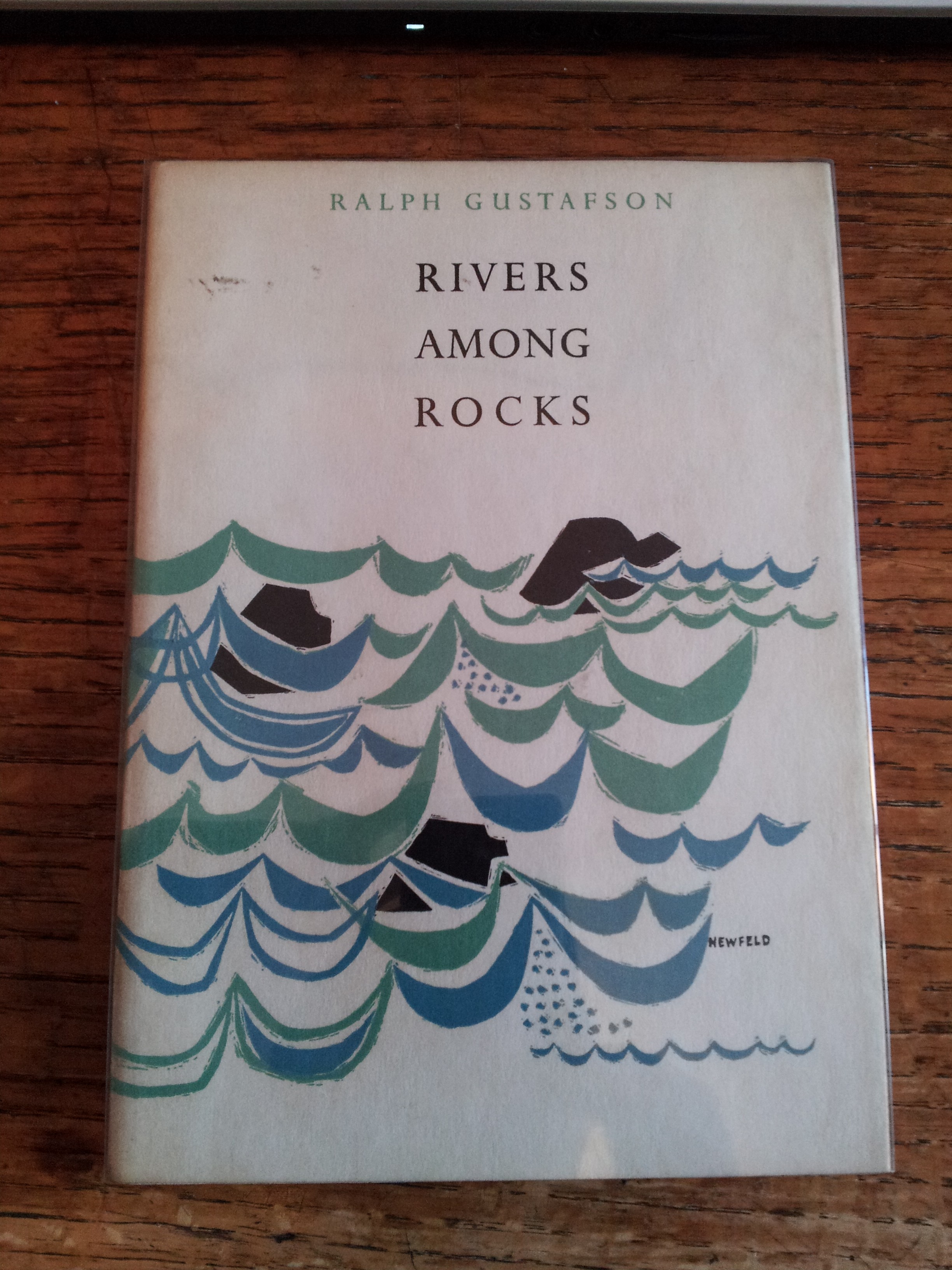
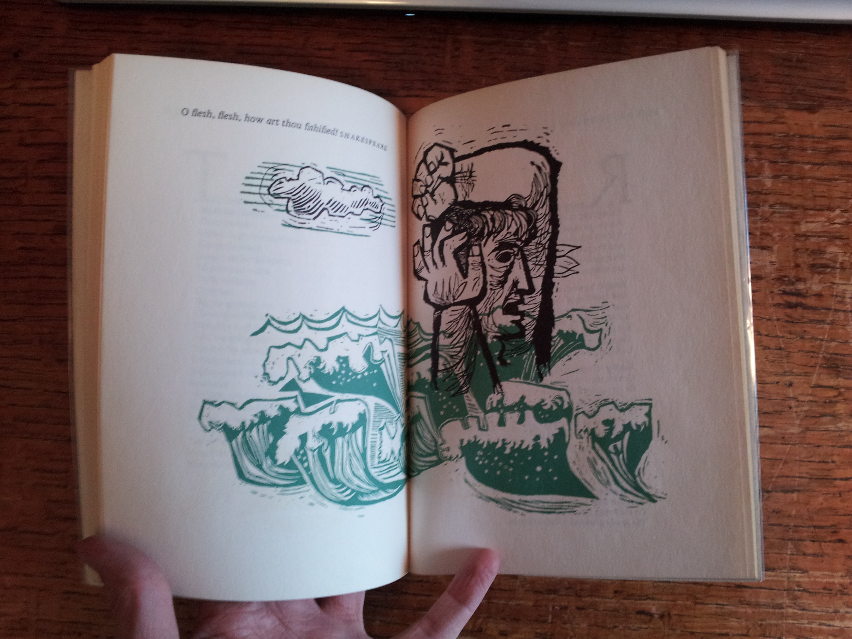
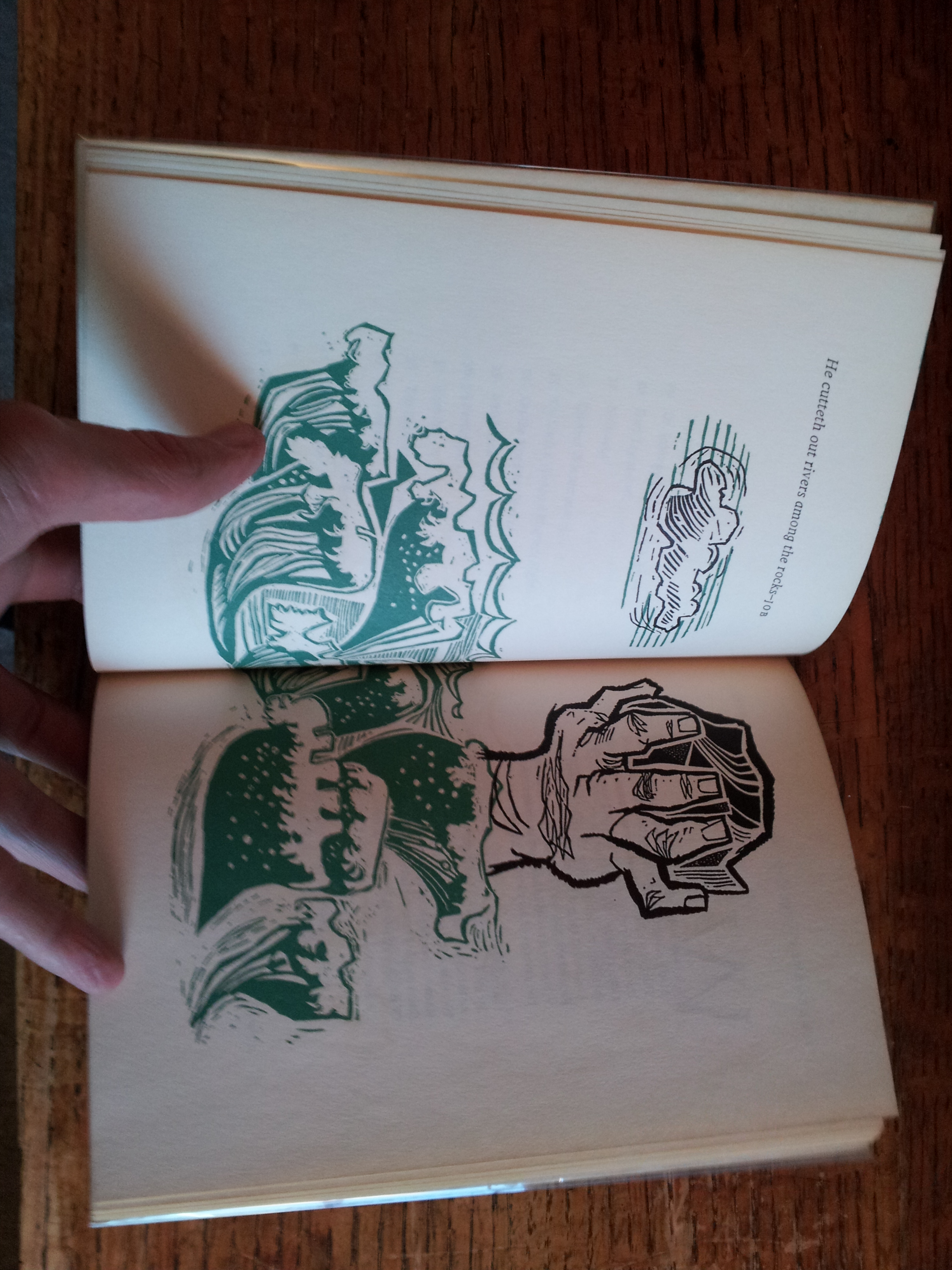
As is often the case with modern Canadian book design, we begin with Frank Newfeld. These are photos from two of the “Design for Poetry” titles: Ralph Gustafson’s Rivers Among Rocks (1960) and Phyllis Gotlieb’s Within the Zodiac (1964), both published by McClelland & Stewart. Read what Randall Speller has to say about the series in his wonderful article from Devil’s Artisan.


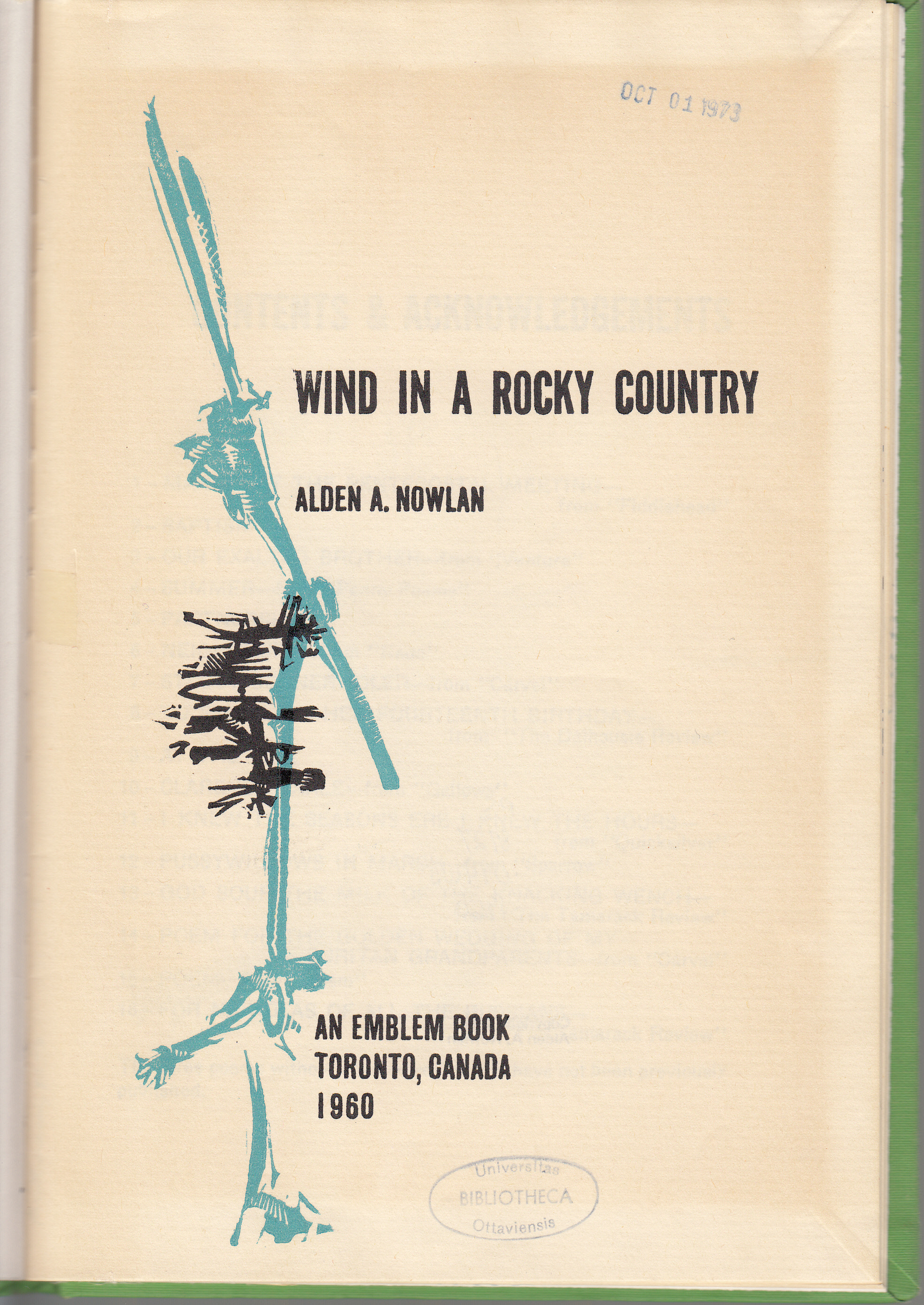
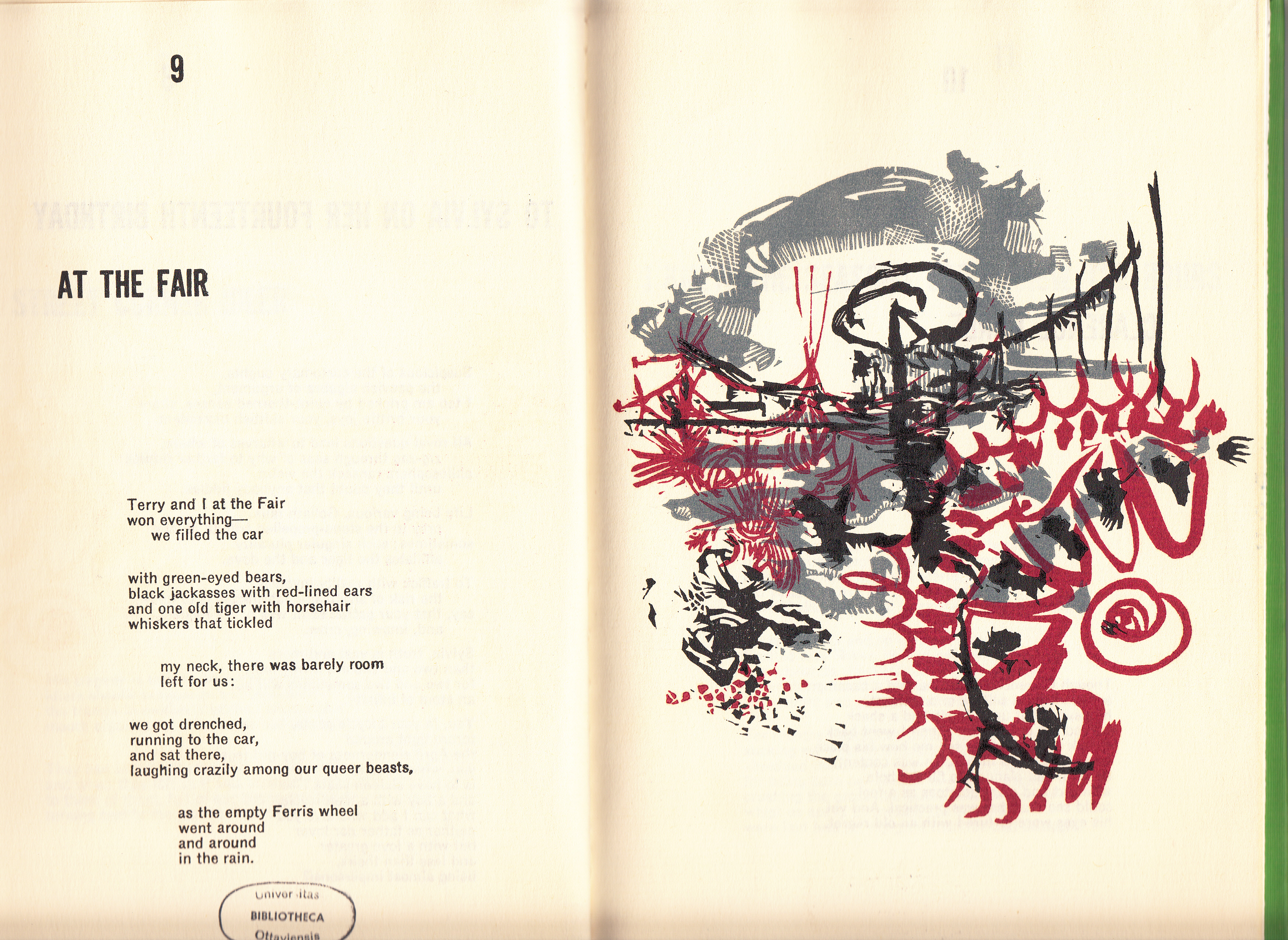
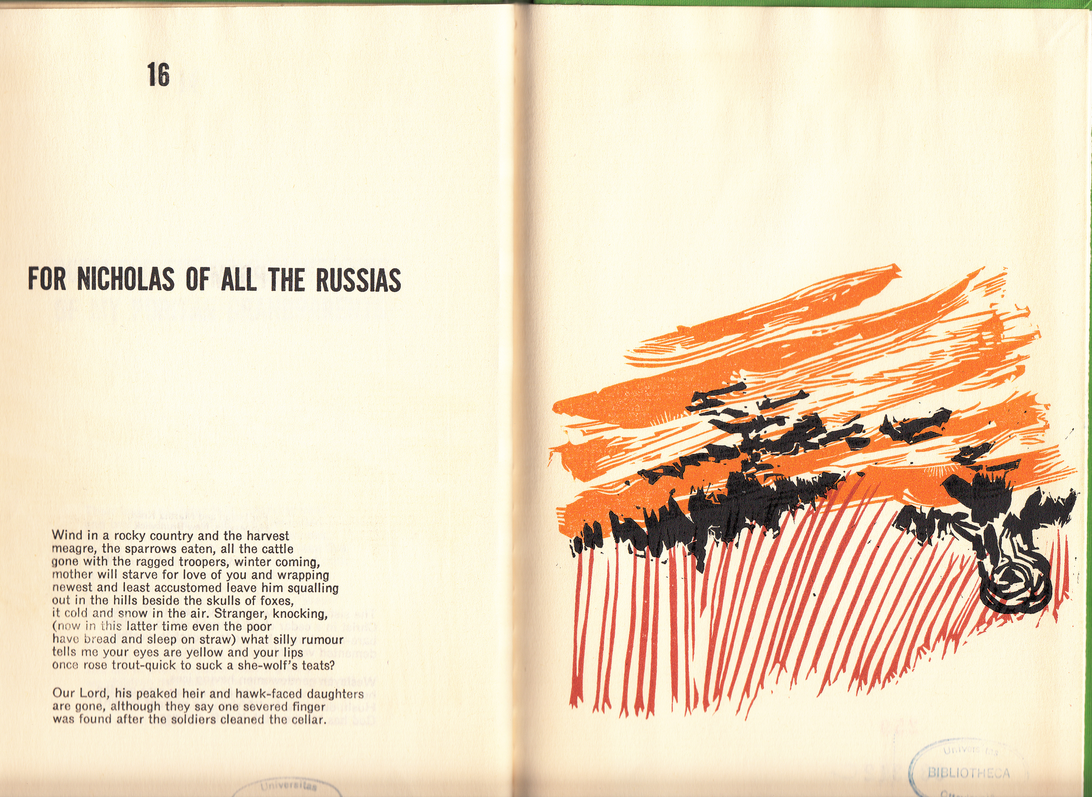
Moving chronologically, here are images from the two books that came off of the Blue R Hand Press for Emblem: Wind a Rocky Country by Alden Nowlan (1961) and The Blur in Between by Al Purdy (1962).


Stan Bevington has been explicit regarding his admiration for Frank Newfeld’s design work and it’s influence on what Coach House went on to do. Below are images from one Coach House title (I’ll do another post at some point with images of a number of Coach House books from the late 1960s and early 1970s), Joe Rosenblatt’s The LSD Leacock (1966). Note that this is the second printing from 1968.


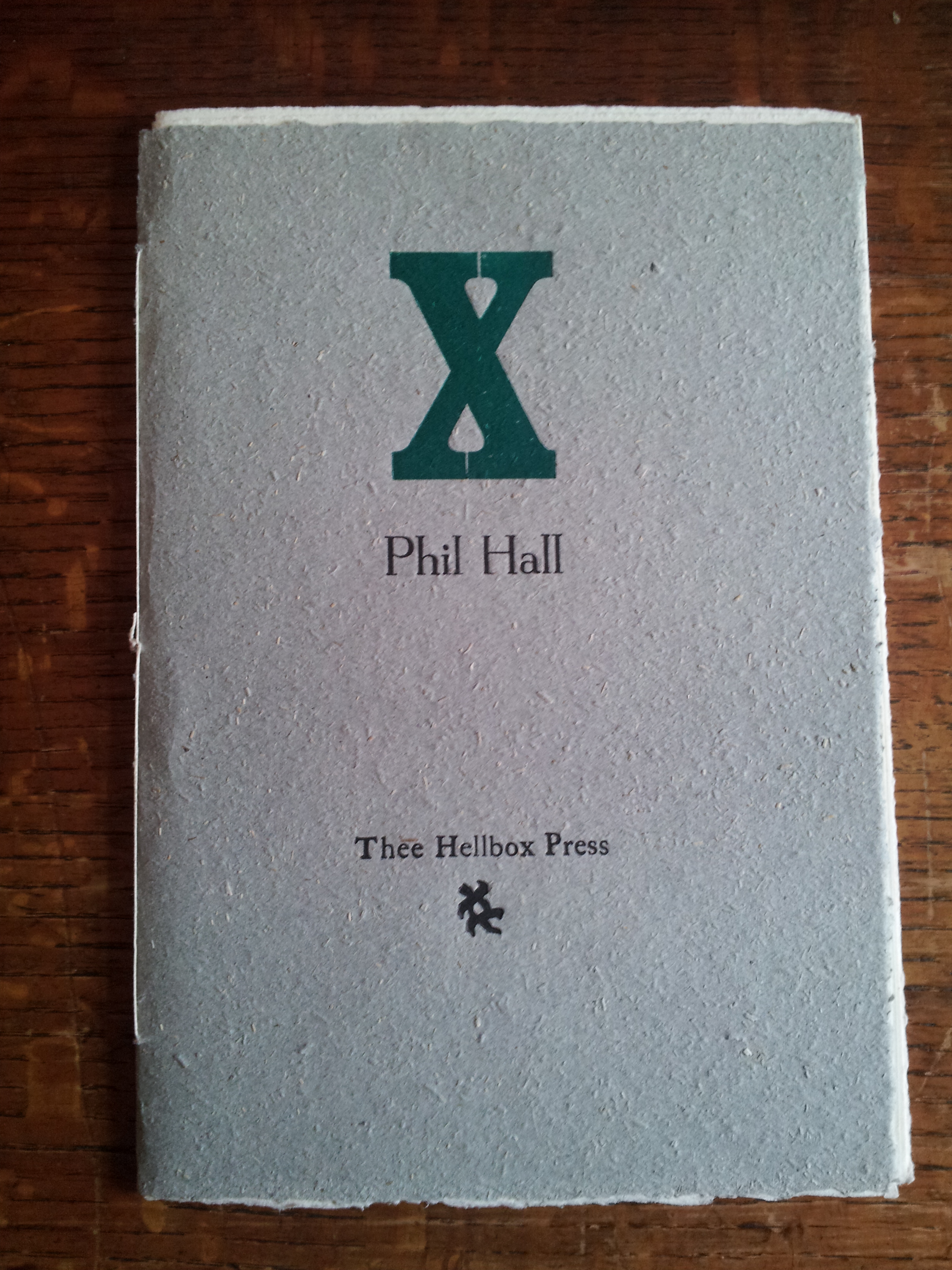
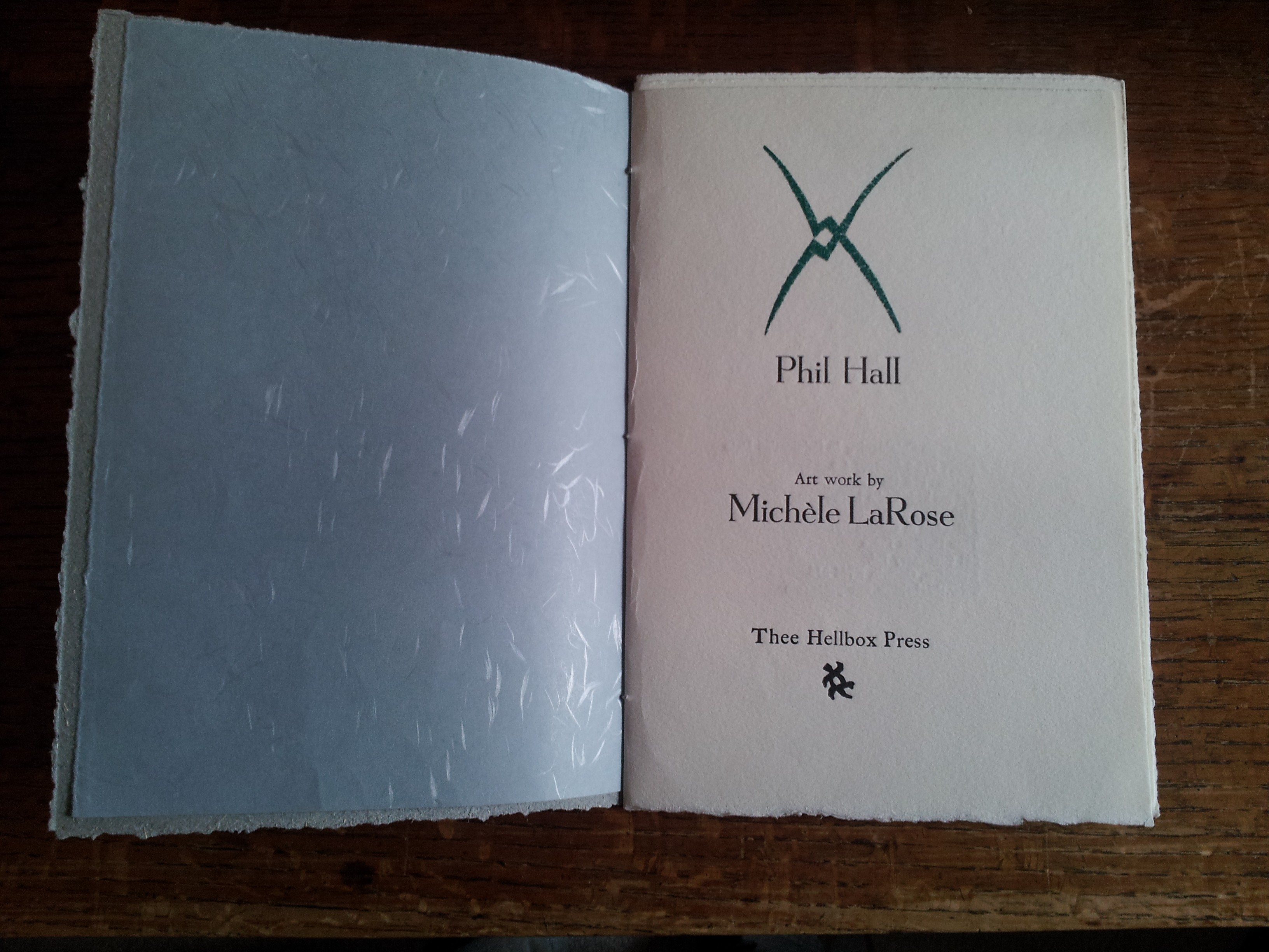
Finally, the last book is brand new. Phil Hall’s X was recently published by Thee Hellbox Press run by Hugh Walter Barclay out of Kingston, Ontario. This book in particular reminds me of Rosewarne’s work on behalf of Emblem. Amazingly, Thee Hellbox is included in the 1995 catalogue Fine Printing. Operating since 1981, Barclay has clearly learned how to get the most out of his printing. I aspire to this work.

There is an awful lot to aspire to. When I someday get the new, more literal press of Apt. 9 Press operating, I hope to begin fumbling my way in their direction. Thanks for all the beautiful books!
[I do not own the rights to any of these books or images. They are reproduced here with respect and admiration. If you want one pulled down, do not hesitate to contact me and I will do so immediately.]

Fran was a friend of my mothers and I have two prints by Fran and one by Bob.